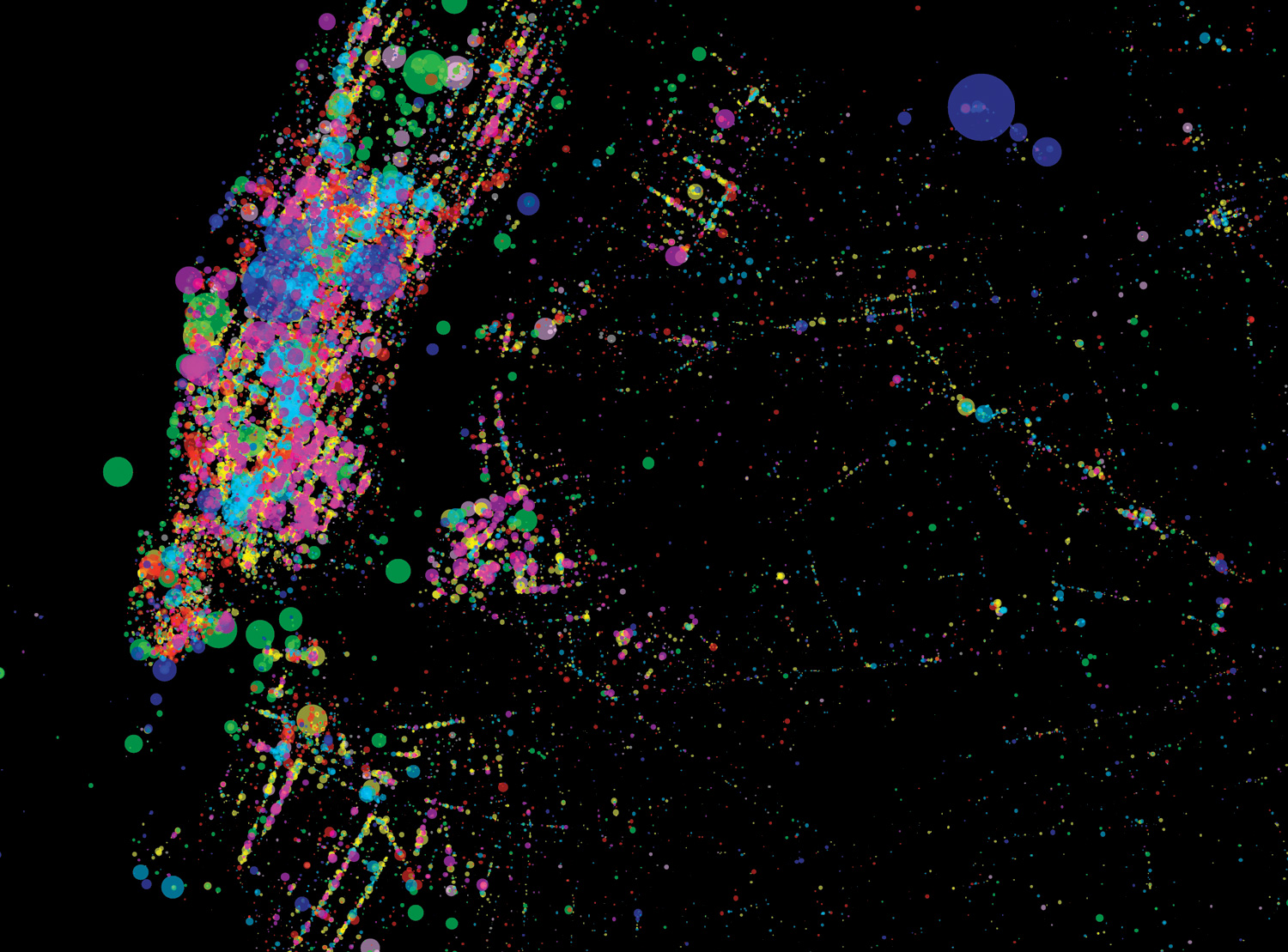
Above: Sarah Williams mapped the activities of social-media users in New York City during one week in July 2011, on the basis of their Foursquare updates. Green dots represent outdoor activities; mauve, arts events; hot pink, nightlife; red, work; yellow, dining; light blue, shopping; and dark blue, arrivals and departures at travel hubs.
Interpretive mapmaking in the United States has a spotty history. The low point, urban planners agree, came in the 1930s, when bureaucrats at the federal Home Owners’ Loan Corporation produced maps of some 240 US cities showing each neighborhood’s average residential income. The maps were intended to help government officials implement a mortgage-relief program for distressed borrowers, but they turned out to be an ideal tool for those who wished to discriminate. Over the next few decades, private banks used the maps to justify their refusing mortgages to blacks in the poorest areas, on the basis that residents of these neighborhoods could be considered “high-risk.” Redlining, as the practice came to be called, was common in many US cities until the 1970s, when it was finally outlawed.
“Those maps were powerful because they were colorful, easy to interpret, and they told a clear story,” says Laura Kurgan ’90GSAPP, an associate professor of architecture and the director of Columbia’s Spatial Information Design Lab (SIDL) at the Graduate School of Architecture, Planning, and Preservation. “Would bankers have discriminated against residents in those areas anyway? Perhaps. But the maps made it easy. And back then, only small numbers of people had access to social data or the ability to visualize it, so not a lot of thematic maps were made. Those in existence were very influential.”
More data, more maps, more stories. More voices participating in a conversation about how to view our cities, address their problems, and serve their residents. That’s the goal of Kurgan and her colleagues at SIDL, who, for the past eight years, have been training civic organizations, nonprofit groups, and ordinary citizens to tell their own stories through thematic cartography: the practice of creating maps overlaid with statistical information.
SIDL researchers, working with collaborators around the world, have made maps that show where air quality in Beijing is worst, where traffic congestion in Nairobi could be alleviated, which Los Angeles neighborhoods are most dependent on immigrant labor, and which New York City streets frequently have trash pile up because of missed collections.
They even helped stop a New York City rezoning proposal. In 2009, with the city considering an ordinance to allow high-end commercial tenants into Manhattan’s Garment District — on the theory that the physical proximity of garment retailers and suppliers is less important in the Internet age — SIDL researcher Sarah Williams distributed cell phones equipped with global positioning system (GPS) technology to dozens of garment workers. She encouraged them to send SIDL a text every time they made a fabric delivery, trim pickup, or costume inspection. The resulting maps demonstrated that the garment workers were constantly dashing around the eight-block district; the City Council soon shelved the proposal.
“Some of our collaborators are nonprofit research groups that come to us for help displaying their findings,” says Kurgan. “In other cases, as with the garment workers, we’re helping citizens collect data and then create visuals to demonstrate something about their lives.”
A thematic map, like any tool for presenting statistics, will reveal the biases of the person who produces it. Consider, for example, a crime map. If you were to plot on a map the 150,000 serious crimes that occurred in New York City last year, how would you do it? A map showing one dot per crime would frighten people away from Times Square and Midtown Manhattan. If the data were adjusted for each neighborhood’s population and commercial density, Times Square and Midtown would look safe, and northern Manhattan and northern Brooklyn would appear most dangerous. A map displaying only violent crimes would look different still. Police departments, when deciding where to dispatch their officers, typically use a combination of these mapping strategies.
But all those approaches share an underlying assumption: that the best way to stop crime is to see where it happens. In 2005, Kurgan and her SIDL colleagues, together with the Brooklyn-based nonprofit Justice Mapping Center, hit upon an altogether new way of looking at crime. Using statistics from state corrections departments across the US, they created a series of maps showing how much money is spent to incarcerate people from certain inner-city neighborhoods. The maps reveal that in some places the government is spending more than a million dollars annually to imprison people from a single block.
The stark black-and-red matrices that compose SIDL’s Million- Dollar Blocks project — several of which are now owned by New York’s Museum of Modern Art — are meant to provoke questions, such as, if more investments were made in afterschool programs, parenting classes, or playgrounds in those neighborhoods, could crimes have been prevented and money saved?
“Our goal was to bring the problem of mass incarceration down to the street level,” says Kurgan, who notes that the maps, produced for New Orleans, Wichita, Phoenix, and New York, have been periodically updated. “We wanted to show the places, in a granular way, where policies were having an impact, and to create something that could be useful to people who want to change those policies.”
Some SIDL projects are less weighty. Last year, Williams programmed her computer to download huge amounts of information from the website of Foursquare, a social-networking service that uses GPS receivers in cell phones to enable subscribers to broadcast their whereabouts to friends. Williams hoped that if she mapped the precise locations of Foursquare updates — information publicly accessible on the service’s main page — she might reveal something interesting about life in cities.
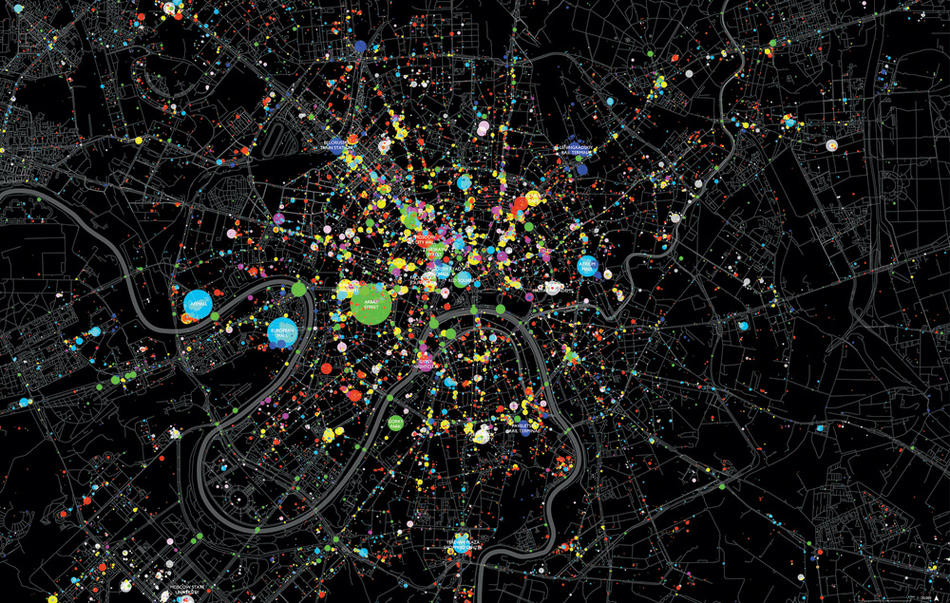
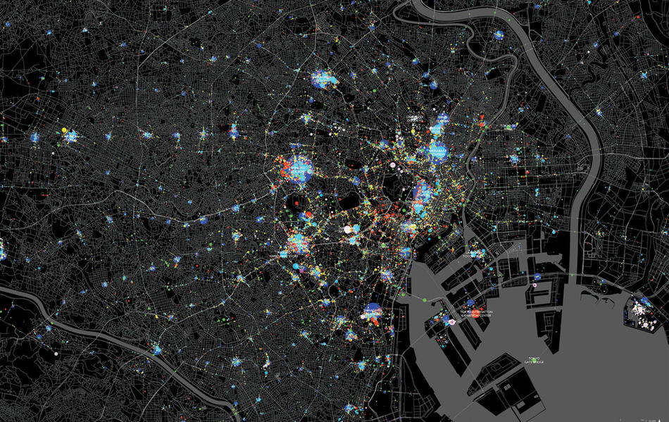
For one week in July 2011, a computer in SIDL’s office at the architecture school downloaded the content of every Foursquare update from New York City, Moscow, Beijing, Tokyo, Rio de Janeiro, Mexico City, and Mumbai. By the week’s end, people in these cities had posted more than two million updates. Williams, using another computer program she created for the task, then translated the information into dots whose colors represent the type of activity popular at a location — green for outdoor activities, mauve for arts events, yellow for dining, hot pink for nightlife, and so forth — and whose sizes represent the number of Foursquare users engaged in the activity.
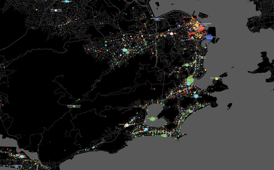
The brilliantly colored maps do hint at patterns: in Tokyo, young people in search of nightlife cluster around subway stops; in Rio, they rarely venture from Ipanema beach; and in Moscow, shoppers populate the city’s outer rings, where several Western-style megamalls have been built in recent years.
Heading into the project, Williams had expected to find Foursquare activity in New York City concentrated in wealthy and white neighborhoods. If this were true, she thought, it would suggest a digital divide in social-media use with implications for, among other things, how city agencies and nonprofits communicate with those who need their services. “Imagine you’re a health-care organizer trying to educate people about air-quality problems,” she says. “Should you use social media? That’s a popular strategy right now. But are people in poor neighborhoods really using these sites? That’s difficult to know.”
In fact, her map shows that New Yorkers across the entire city, from Chelsea to Harlem and Brownsville to the South Bronx, are using Foursquare regularly. (While most activity occurs in Midtown and Lower Manhattan, the number of updates in those areas is proportional to their density.)
“New York is a social-media city, top to bottom,” says Williams, who was recently invited by Mayor Michael Bloomberg’s office to show city officials how they might use her methods to learn which public squares and parks are busiest. “We found patterns in the data that you couldn’t see before — stories that didn’t exist. The maps really make them pop.”
Douglas Quenqua contributed reporting to this article.


