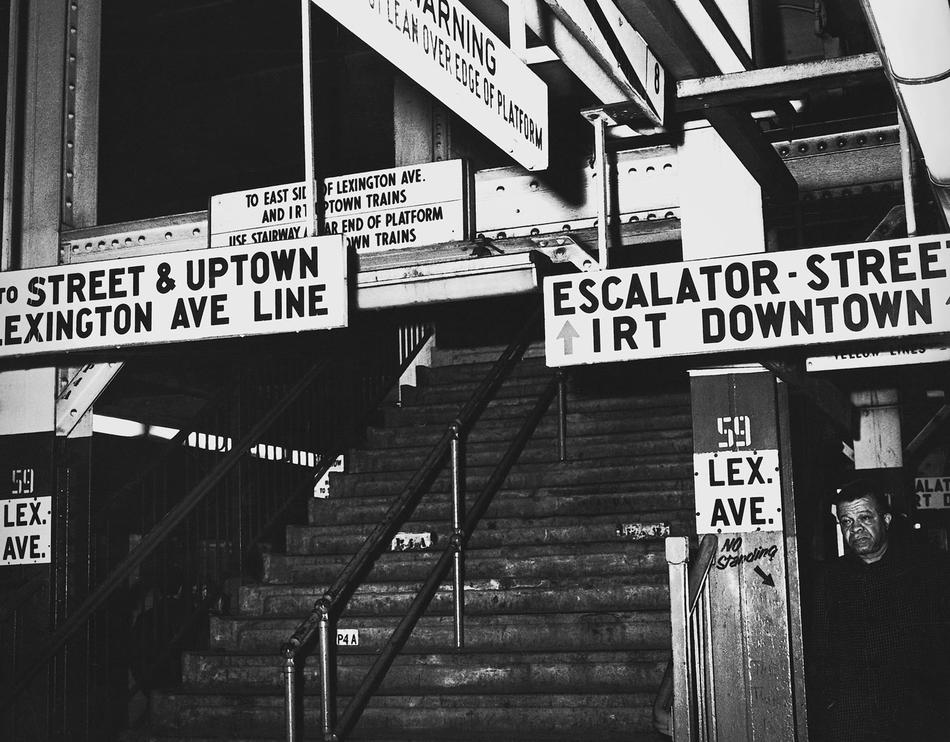
“Flubway,” as the Daily News called the disastrous opening of the Chrystie Street Connection in 1967, was supposed to inaugurate a brighter era for the New York City subway system. After decades of torturing commuters and baffling tourists with a jumble of poorly marked routes and transfer points, the transit authority had engineered an enlightened rebirth: a newly commissioned system of color-coded, numbered and lettered route designations, with accompanying signs, maps, and train emblems. But on opening day, travelers found a bewildering mixture of new signs, old signs, and no signs at all. The grand attempt at order had produced, as New York magazine put it, “a battlefield filled with typographers and color-experts locked in mortal combat.”
We are still near the beginning of an era when a publisher might hope to tempt non-expert readers with even the most dramatic story about design. A generation ago, a layperson could not be expected to name a single typeface; suddenly, a flawed redesign of an orange-juice carton can spark a consumer revolt. In Helvetica and the New York City Subway System, Paul Shaw ’80GSAS — a lettering artist and design historian — has a story to tell that is more obscure than most: he wants to dispel the misconception that the iconic mid-century Swiss-modern typeface Helvetica created the subway’s distinct graphic look. In fact, Helvetica was a Johnny-come-lately replacement for a lesser-known cousin, Standard, which prevailed between the late 1960s and 1980s.
Thankfully, this esoteric inquiry leads Shaw to a development of broader importance: the transit authority’s 1960s effort to modernize its aging labyrinth. Originally built as three competing rail companies between 1904 and 1940, the New York City subway remained so fragmented, as historian Clifton Hood ’86GSAS explains in the book’s foreword, that one company’s trains did not fit in another’s tunnels. The Chrystie Street Connection was to finally link disparate lines underground. But making them navigable would mean taking a new approach to signs. On the advice of a Museum of Modern Art curator, the transit authority hired the design firm Unimark, which spent weeks tracing commuters’ steps. In the end, Unimark recommended simple, clear signs that replaced route descriptions with colored icons. The new system’s clumsy debut can be blamed on the transit authority’s sign shop, which initially lacked the conviction to carry out Unimark’s vision. It was a culture clash that, as Shaw writes, “reflected fundamentally different expectations between craftsmen and designers.”
Type enthusiasts are obsessive by nature, ruled by grids and fine measurements. While Shaw painstakingly catalogs the evolution of the transit authority’s graphic-standards manual and canvasses the world’s transit design schemes of the 1960s, the reader can happily float above the text and enjoy photographs of early-century mosaic signs, bygone graffiti-strewn interiors of subway cars and stations, and archival maps and documents. The book does not dwell on the signs’ beauty, but this is an essential, implicit theme. It is an everyday beauty, the kind that catches you for a moment before you go on your way.