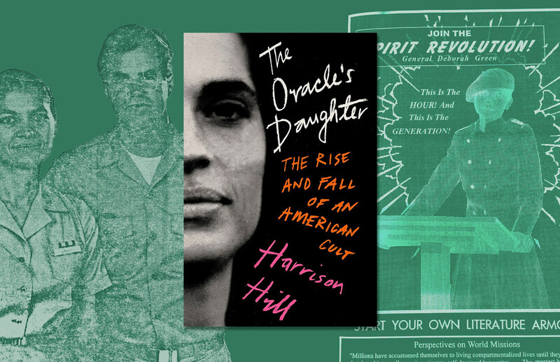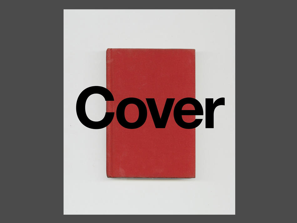
Peter Mendelsund’s Cover — a compilation of book covers and jackets that Mendelsund ’91CC designed over his eleven years (so far) in the business — is a confident-looking art book, but when the author tells his own story, he sounds surprisingly unsure. Design was Mendelsund’s second-choice profession, a stopgap while he re-evaluated his career as a concert pianist. He had studied piano from boyhood and then at conservatory, but he taught himself design on his home computer in less than a year, and was shocked when the publisher Knopf hired him on the basis of a ragged portfolio and an interview done as a favor to his mother. In the book’s foreword, Mendelsund confesses that he is still coming around to self-identifying as a designer, though the present volume amounts to an admission that “perhaps what I am is what it says I am on my business card.”
And yet Mendelsund’s covers bear none of this hesitancy. Simple and unforced, they fulfill Will Strunk’s mandate that art should be like a machine with no unnecessary parts. His layering of photographs, drawings, and type gives the covers a three-dimensional quality — even an implied motion, like a freeze-frame of a film that might start up again at any moment: a pair of dancing feet mid-lesson, a twisting wisp of flyaway hair, a churning construction-paper sea. You want to touch them and take them home and hang them on your walls. This thing that Mendelsund isn’t sure he is — he is one of the very best.
Cover designers are translators: they convert hundreds of pages of words into a modest rectangle of color, shape, and pattern that for most readers will be their first impression of a book (and for many others their last). Their tools are manifold but finite. Mendelsund, a methodical thinker, enumerates the possible subjects of a book’s cover art: character, object, event, place, time, text sample, tone, plot, theme, and parallel imagery. Of course, these are not equal choices. Pictures of people should generally be avoided, because they can “rob readers of their satisfying acts of imagination.” Objects work better, because they are “saturated with metaphoric potential.” The worst cover Mendelsund labels “The Tell-All”: it is crammed with illustrations of plot events. “Only one part of the author’s output is being addressed here — the most mundane part, namely: ‘what happens’ during the course of a given tale,” Mendelsund writes. “I detest this kind of jacket.”
But avoiding the tell-all is no small challenge. Mendelsund is all too aware that the cover designer and the author work, in a sense, at cross-purposes: the author traffics in the intellectual and free-floating, the designer in the concrete and fixed. “It is my job,” he writes, “to drag the text, the author’s work, perfect in its disembodiment, into awful specificity.”
He copes with this imbalance by favoring a modernist, semi-abstract aesthetic that had been more or less out of fashion since the middle of the twentieth century. For his redesign of the works of Kafka, for instance, he uses a bright-colored eye motif, which conveys Kafka’s humor, alienation, and surrealism better than any photograph could. On the cover of The Metamorphosis, rather than an insect we see a pair of eyes: one human, one hexagonal and compound. (Whether we are viewing these eyes from the inside or the outside remains ambiguous.) A book of letters between Kafka and his love Milena is covered in fragments of faces and lines of motion, capturing the long-distance relationship in a few gestures. Mendelsund benefits from the constraints of a visual theme; his work seems to say, see how much I can do with so little.
While Mendelsund excels at series design, his highest-profile series is his least interesting: the cover of The Girl with the Dragon Tattoo has an uncharacteristic blandness that is likely a byproduct of the publishing bureaucracy (though the covers improve as the series goes on). Compare these with Mendelsund’s covers for another Swedish crime trilogy, Jens Lapidus’s Stockholm Noir books: their neon-colored backgrounds, black-and- white photos of weapons, and gratuitous accent marks (Mendelsund writes the titles as Life Delüxe, Easy Møney, and Never Fück Up) make the books exude a perversely joyful criminality. Or take Jo Nesbø’s Harry Hole series, whose deliciously ominous covers are decorated with bloodstained scraps of newspaper.
Mendelsund’s covers deliver pure emotion, but his writing — whether in Cover or its companion volume, What We See When We Read — tends toward the cerebral. WWSWWR, an illustrated meditation on how our minds turn fiction into mental images, presents Mendelsund as an inveterate questioner, testing his ideas through thought experiments, with an occasional reference to Wittgenstein or Barthes. He brings the same scholarly intensity to the books he designs. “When I first spoke with Peter,” writes Ben Marcus, a Columbia professor of creative writing, in a short contribution to Cover, “I was struck by how carefully he’d read [my] book. He fucking seemed to have studied it. This is the kind of close reading one longs for from an editor. To have it from a designer is unnerving and, of course, a piece of very good luck.”
When he’s feeling doubtful about his identity as a designer, Mendelsund likes to tell himself that design is easy. Compared to his first career, he writes, design has the freedom of the rehearsal without the fear of the concert, and with this confidence comes daring and playfulness. In a conversation with Peter Terzian for the New Yorker’s website, Mendelsund says he got a “crazy revelation” on the subway that he should design text-only covers for the works of Italo Calvino, each one bearing a description of an imaginary book jacket. It’s no wonder the anxious authors who put themselves in his hands invariably end up grateful. “Peter’s cover is like the novel’s score,” writes Alexander Maksik. “What magic this is.”